Design
The Design system makes it easier to launch new services in a short time, and greatly simplifies the operation and maintenance of public digital services. The system is open to anyone who wants to look.
Table of contents
Design system
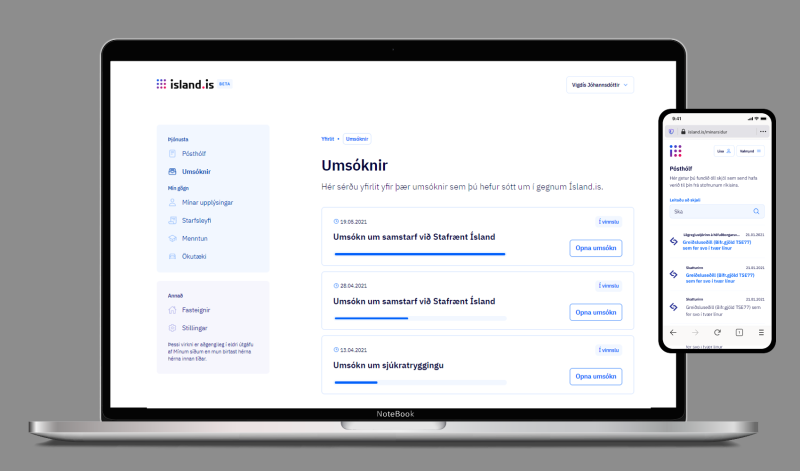
The Icelandic design system is meant to coordinate the approach of different parts of the project. Overall consistency in design is important for user experience; both enjoyment and efficiency, but no less to create trust.The design system makes it easier for us to launch new services fast, and greatly simplifies the operation and maintenance of digital public services.The design system is open to anyone to anyone who wants to take a look, it is accessible in Figma. Furthermore, we maintain a UI library that is our version of the design system in React.


Accessible and attractive
Design must be clear, simple and accessible. It needs to meet accessibility standards, but we also want the interface to be attractive because the look has an impact on the user's experience of the service.
Simplicity
Transparency of interfaces
Clear message, clear functionality
Repeated patterns
We try to keep the interface and user flow consistent, and use the same pattern in the interface for the same actions. The fewer patterns the better, without compromising user experience for each case.
Content first
We try to maintain a Content first approach to the design as possible. We make decisions on the basis of the content and the user's needs in this regard.Design (especially service design) is largely content based. Therefore, it is important to work with a text that has meaning, not Lorem ipsum or other placeholder texts.
Logo Ísland.is
On March 10, 2020, the new logo and look of Ísland.is was introduced. The new look marks the beginning of a vastly improved digital public service and reflects today's demands for automation, simplicity and digital solutions.
The dots in the new logo represent a network of different connections and show the relationship between individuals, public services and data. The dots can also be distinguished by the letters is, the symbol of domains in Iceland, which refer to services in the digital arena.
Download the logo in
Other versions of the logo and rules about its use are accessible in Figma.
Ísland.is logo animated (click on image to play):
The goal is for individuals and businesses to be able to access public services in a simple way, in one place. This goal is captured in a new slogan:


On Ísland.is, you can gradually access all services in one place – you can get straight to the content.

